Single-cell projects balloon out to the sheer number of cells—up to over a million in some cases. For instance, how to handle single-cell data fast in R when there are millions of cells? The general agreement is that Python is suitable for GPU acceleration. However, different people will say that those are somewhat feeble in Python. Get this übercool biodataviz weapon for Python created and shared by Marsilea’s developer.
R and Python are the most environmental languages used in data science. Still, they lack a way to visualize as elegantly as R. Marsilia is currently trying to change this situation.
For a research result to be well understood, several plots must describe all data set dimensions. I will give an example, taking the single-cell expression matrix. When you use a heatmap to draw a picture of the expression matrix (heatmap), we add a sidebar chart that shows the number of cells and a violin plot that shows gene distribution to show other aspects. This type of visualization paradigm is referred to as composable visualization in Marsilea.
Origin of the name Marsilea
Marsilea originates from the Latin word for four-leaf clover—the shape the composed visualization looks like in the end.
Installation and related resources
Marsilea can be installed directly using pip. Enter in the command line:
pip install marsilea
- GitHub repository: https://github.com/Marsilea-viz/marsilea (The stars 🌟 you leave are the greatest encouragement to the project.)
- Documentation (English only): https://marsilea.rtfd.io/
Simple Example for Marsilea
The following is a simple example of creating a simple heatmap in Marsilea. If you have used a complex heatmap, it may help you understand it.
# Import numpy and marsilea
import  numpy  as  np
import  marsilea  as  ma
import  marsilea.plotter  as  mp

# Create some random data
 data = np.random.rand( 20 ,  20 )
cat = np.random.choice([ "A" ,  "B" ,  "C" ],  20 )

# Initialize the heat map
 h = ma.Heatmap(data, linewidth= 1 )
# Add a colors on the left
# Set the size of the placeholder (size) to 0.2
# Set the pad between adjacent figures to 0.1
 h.add_left(mp.Colors(cat), size= .2 , pad= .1 )
# Add hierarchical clustering on the left and top
 h.add_dendrogram( "left" )
h.add_dendrogram( "top" )
# Add text labels on the right
 h.add_right(mp.Labels(cat), pad= .1 )
# Continue to add a bar chart on the right
 h.add_right(mp.Bar(data.mean(axis= 0 )), pad= .1 )
# Final rendering
 h.render()
This is the heatmap you will see
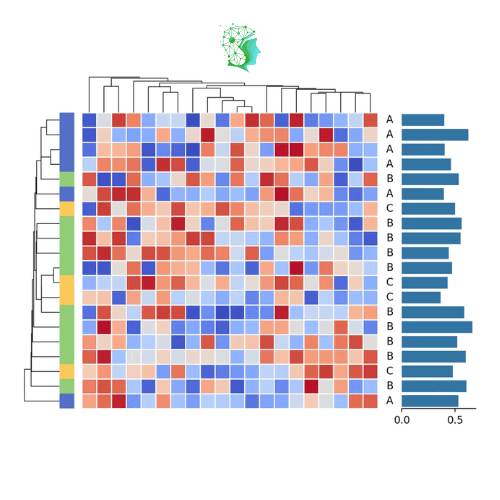
Marsilea provides a variety of visualization modules, and you can splice them together at will. You can also set the size of different modules and the distance between them at will, providing powerful customization capabilities.
Gallery Showcase (Marsilea)
Visualize single-cell pbmc3k data (the code is a bit long, you need to structure it yourself)
#Introduce marsilea
import  marsilea  as  ma
import  marsilea.plotter  as  mp
#Introduce other related packages
import  matplotlib  as  mpl
import  matplotlib.pyplot  as  plt
from  matplotlib.colors  import  Normalize
from  sklearn.preprocessing  import  normalize

#Get data
 pbmc3k = ma.load_data( "pbmc3k" )
exp = pbmc3k[ "exp" ]
pct_cells = pbmc3k[ "pct_cells" ]
count = pbmc3k[ "count" ]

matrix = normalize(exp.to_numpy(), axis= 0 )

cell_cat = [ "Lymphoid" ,  " Myeloid" ,  "Lymphoid" ,  "Lymphoid" ,
      "Lymphoid" ,  "Myeloid" ,  "Myeloid" ,  "Myeloid" ]
cell_names = [ "CD4 T" ,  "CD14\nMonocytes" ,  "B" ,  "CD8 T" ,
        "NK" ,  "FCGR3A\nMonocytes" ,  "Dendritic" ,  "Megakaryocytes" ]

# Create visualization
 cells_proportion = mp.SizedMesh(
    pct_cells,
    size_norm=Normalize(vmin= 0 , vmax= 100 ),
    color= "none" ,
    edgecolor= "#6E75A4" ,
    linewidth= 2 ,
    sizes=( 1 ,  600 ),
    size_legend_kws=dict(title= "% of cells" , show_at=[ 0.3 ,  0.5 ,  0.8 ,  1 ]),
)
mark_high = mp.MarkerMesh(matrix >  0.7 , color= "#DB4D6D" , label= "High" )
cell_count = mp.Numbers(count[ "Value" ], color= "#fac858" , label= "Cell Count" )
cell_exp = mp.Violin(exp, label= "Expression" , linewidth= 0 , color= "#ee6666 " ,density_norm= "count" )
cell_types = mp.Labels(cell_names, align= "center" )
gene_names = mp.Labels(exp.columns)

# Group plots together
h = ma.Heatmap(matrix, cmap= "Greens" , label= "Normalized\nExpression" , width= 4.5 , height= 5.5 )
h.add_layer(cells_proportion)
h.add_layer(mark_high)
h.add_right(cell_count, pad= 0.1 , size= 0.7 )
h.add_top(cell_exp, pad= 0.1 , size= 0.75 , name= "exp" )
h.add_left(cell_types)
h.add_bottom(gene_names)

h.hsplit(labels=cell_cat, order=[ " Lymphoid" ,  "Myeloid" ])
h.add_left(mp.Chunk([ "Lymphoid" ,  "Myeloid" ], [ "#33A6B8" ,  "#B481BB" ]), pad= 0.05 )
h.add_dendrogram( "left" , colors=[ "#33A6B8" ,  "#B481BB" ])
h.add_dendrogram( "bottom" )
h.add_legends( "right" , align_stacks= "center" , align_legends= "top " , pad= 0.2 )
h.set_margin( 0.2 )
h.render()
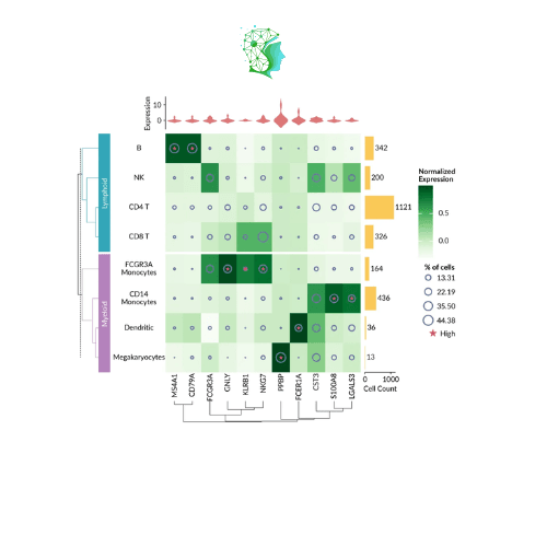
Of course, you don’t need to draw a heatmap, and Marsilea is not limited to heat maps! Any kind of graph can be drawn and combined!
import  marsilea  as  ma
import  marsilea.plotter  as  mp

import  mpl_fontkit  as  fk
fk.install_fontawesome(verbose= False )
fk.install( "Lato" , verbose= False )

oils = ma.load_data( "cooking_oils" )

red =  "#cd442a"
 yellow =  "#f0bd00"
 green =  "#7e9437"
 gray =  "#eee"

 mapper = { 0 :  "\uf58a" ,  1 :  "\uf11a" ,  2 :  "\uf567" }
cmapper = { 0 :  "#609966 " ,  1 :  "#DC8449" ,  2 :  "#F16767" }
flavor = [mapper[i]  for  i  in  oils[ "flavour" ].values]
flavor_colors = [cmapper[i]  for  i  in  oils[ "flavour" ].values]
fat_content = oils[
    [ "saturated" ,  "polyunsaturated (omega 3 & 6)" ,  "monounsaturated" ,  "other fat" ]
]

fat_stack_bar = mp. StackBar(
    fat_content.T *  100 ,
    colors=[red, yellow, green, gray],
    width= 0.8 ,
    orient= "h" ,
    label= "Fat Content (%)" ,
    legend_kws={ "ncol" :  2 ,  " fontsize" :  10 },
)
fmt =  lambda  x:  f" {x: .1 f} "  if  x >  0  else  ""
 trans_fat_bar = mp.Numbers(
    oils[ "trans fat" ] *  100 ,
    fmt=fmt,
    color = "#3A98B9" ,
    label= "Trans Fat (%)" ,
)

flavor_emoji = mp.Labels(
    flavour, fontfamily= "Font Awesome 6 Free" , text_props={ "color" :flavor_colors}
)

oil_names = mp.Labels(oils.index.str.capitalize())

fmt =  lambda  x:  f" {int(x)}"  if  x >  0  else  ""

 omege_bar = ma.plotter.CenterBar(
    (oils[[ "omega 3" ,  "omega 6" ]] *  100 ).astype(int),
    names=[ "Omega 3 (%)" ,  "Omega 6 (%)" ],
    colors=[ "#7DB9B6" ,  "#F5E9CF" ],
    fmt=fmt,
    show_value= True ,
)
conditions_text = [
    "Control" ,
    ">230 °C\nDeep-frying" ,
    "200-229 °C\nStir-frying" ,
    "150-199 °C\nLight saute" ,
    "<150 °C\nDressings" ,
]
colors = [ "#e5e7eb" ,  "#c2410c" ,  "#fb923c " ,  "#fca5a5" ,  "#fecaca" ]
conditions = ma.plotter.Chunk(conditions_text, colors, rotation= 0 , padding= 10 )

cb = ma.ClusterBoard(fat_content.to_numpy(), height= 10 )
cb.add_layer( fat_stack_bar)
cb.add_left(trans_fat_bar, pad= 0.2 , name= "trans fat" )
cb.add_right(flavor_emoji)
cb.add_right(oil_names, pad= 0.1 )
cb.add_right(omege_bar, size= 2 , pad= 0.2 )

order = [
    "Control" ,
    ">230 °C (Deep-frying)" ,
    "200-229 °C (Stir-frying)" ,
    "150-199 °C (Light saute)" ,
    "<150 °C (Dressings)" ,
]
cb.hsplit(labels=oils[ "cooking conditions" ], order=order)
cb.add_left(conditions, pad= 0.1 )
cb.add_dendrogram(
    "left" , add_meta= False , colors=colors, linewidth= 1.5 , size= 0.5 , pad= 0.02
 )
cb.add_title(top= "Fat in Cooking Oils" , fontsize= 16 )
cb.add_legends( "bottom" , pad= 0.3 )
cb.render( )

axes = cb.get_ax( "trans fat" )
for  ax  in  axes:
    ax.set_xlim( 4.2 , 0 )
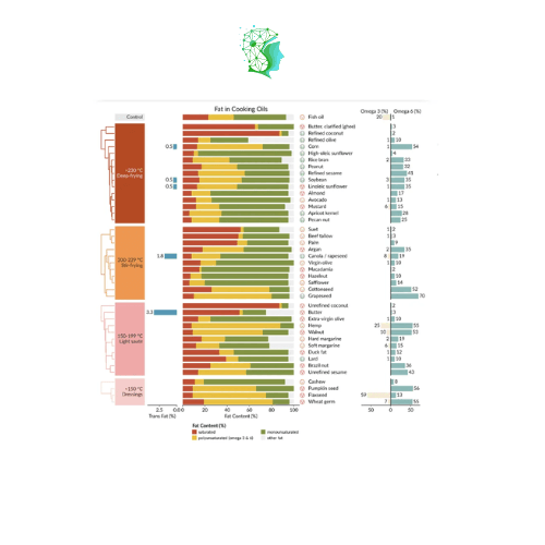
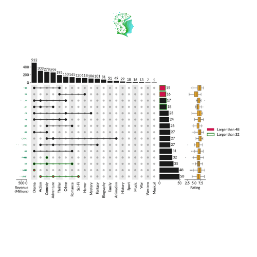
Marsilea can also draw other commonly used visualization images in bioinformatics!
Collection Visualization Upsetplot (Marsilea)
References
https://marsilea.readthedocs.io/en/stable
https://github.com/Marsilea-viz/marsilea


